Patsy Krebs
exhibition essay for Patsy Krebs: Fugue
Eleanor Bliss Center for the Arts, Steamboat Springs, Colorado February 7 - March 28, 2013

Patsy Krebs: Fugue, Eleanor Bliss Center for the Arts at the Depot, Steamboat Springs, CO, 2013
Patsy Krebs, Red Wing #3, 2011 © Patsy Krebs and Oehme Graphics
The process of printmaking allows you to do things that make your mind work in a very different way than, say, painting with a brush does…things that are necessary to printmaking become interesting in themselves…become like ideas. – Jasper Johns[1]
At first glance, it would perhaps seem unlikely that Patsy Krebs would pursue printmaking. For the past thirty-five years, Krebs has developed a strong personal aesthetic and practice for executing her stunning paintings. Often using a restricted color palette and subtle application of pigment to surface, she strives “to get to the absolute simplest forms.” She thus returns time and time again to elemental divisions of space – squares, rectangles, circles – fascinated by how these abstractions “shape a symbolic equivalent to the otherwise ineffable in human experience.” Krebs labors intensely over each painting. In her most recent body of work, titled Hibernal Dreams, she achieves mesmerizing surfaces through innumerable layers of thinned acrylic washes; the panels play with notions of movement as the eye instinctively traces the subtle gradations of color and light radiating from the center. This complex process relies on the artist’s seclusion in her Northern California studio – far from all distractions – as complete focus is imperative to the execution and continual evaluation of her work. In approaching printmaking, one might wonder if Krebs would struggle, as critic Jules Langsner once suggested, with “the irreconcilable conflict between the unique attributes of the work of art and the uniform reproductive processes of the machine.”[2] This interpretation, however, neglects the breadth of creative opportunities this medium possesses, a fact discovered by countless artists including Patsy Krebs.
In the summer of 2011, Krebs traveled to Steamboat Springs, Colorado to work at the recently founded Oehme Graphics with director and master printer, Sue Hover Oehme. Though she had previously worked with Oehme, this more involved project challenged Krebs to not only articulate her distinctive sensibility through the visual and technical tools of printmaking, but also to approach her artistic practice collaboratively.
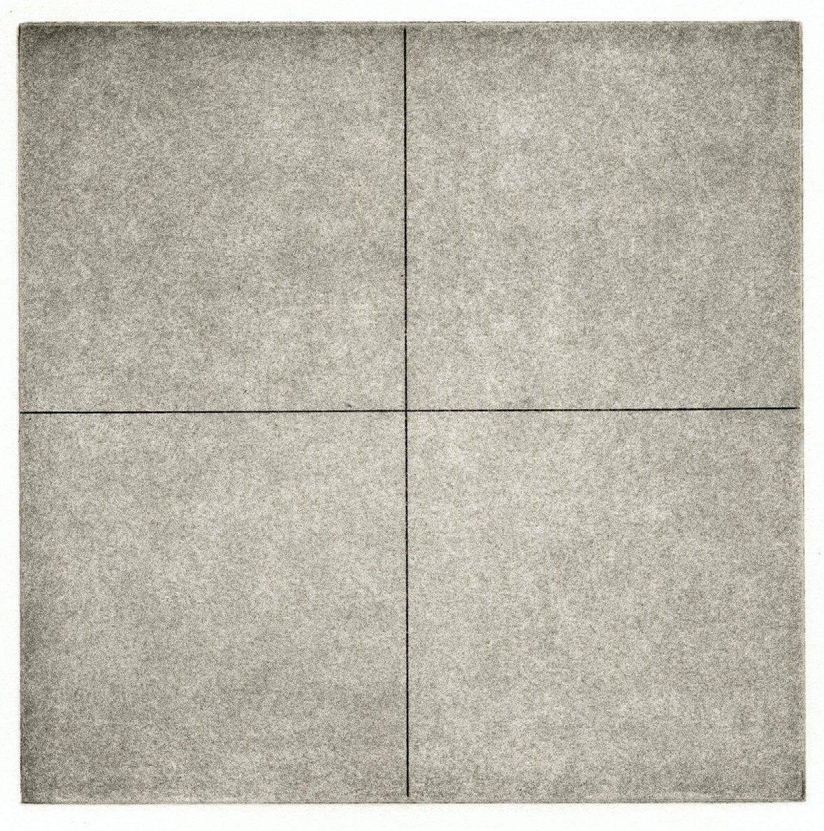
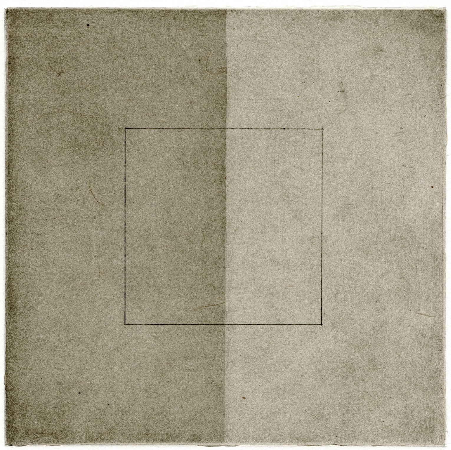
Through these recent prints, Krebs reexamines how various geometric forms relate not only to one another, but also in relationship to scale, color and tonality. Prior to her arrival in Colorado, Krebs produced a series of 6-inch square drawings on graph paper, each with a different division of space or arrangement of dark and light. These small drawings generated approximately thirty copper plates produced primarily using aquatint, which according to Oehme, is “the only intaglio method that produces delicate, even tones which relate specifically to Patsy’s process of layering thin even washes over the surface of her paintings.” Works included in Redwing and Since Brass – the two portfolios produced that summer – resulted from running multiple plates through the press on a single sheet of paper. As the exhibition’s title suggests, these prints visually evoke the fugue form in music; harmonious compositions emerge from the layering of various formal and tonal elements. To add to the simplicity of this investigation, Krebs works only with black, grey and red inks. As opposed to the way paint sits on canvas or panel, here, pigment merges with the paper’s fibers, building exquisitely subtle, sensuous surfaces that are as much a subject matter as the formal elements present. Printed at a small scale, these images encourage the viewer to closely examine, noting almost indiscernible transitions between shade, color and form. Through extraordinarily minimal means, Krebs succeeds in not only producing striking images, but also creating work that continues to resonate with us over time.
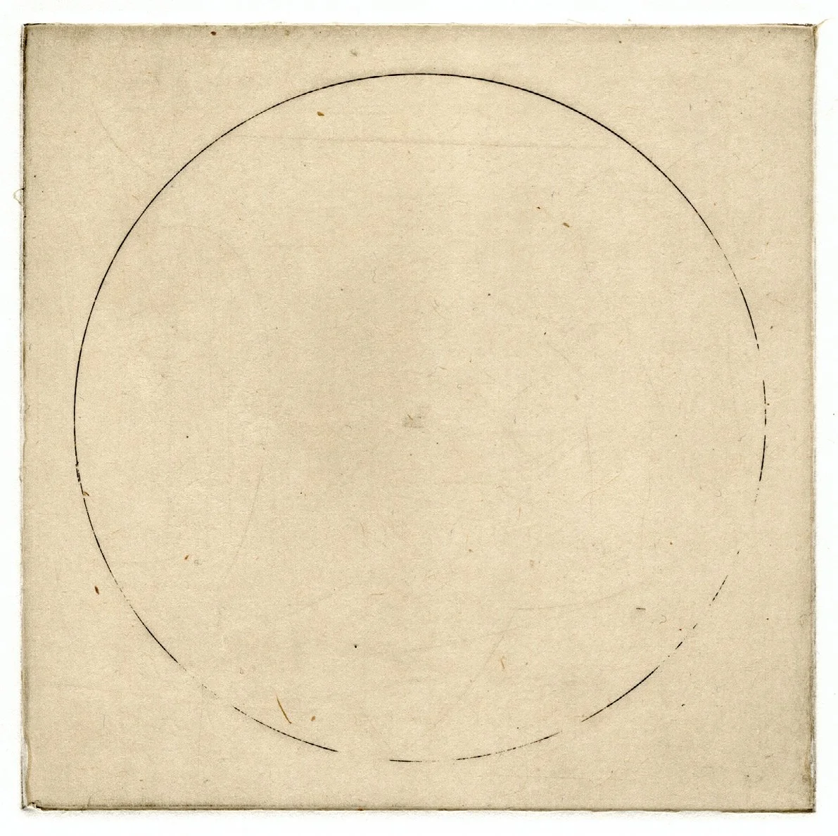
Despite the ostensible simplicity of these prints, they are technically the result of extensive experimentation and deliberate choices. Printmaking necessitates “technique and idea become indivisible,”[3] resulting in a visual translation of Krebs’ aesthetic alongside new possibilities born from the process. While the four larger Untitled prints formally resemble Krebs’ current paintings – produced using infinite layers of paint – the materials and process of printmaking render this complex image through meticulously step-etched plates echoing the gauzy gradation in value from the center rectangle outward. As a counterpoint to these smooth, shifting tones and the soft, dappled colors that appear in both portfolios, printmaking prompted Krebs to incorporate etched, hard-edged lines. Lines appear throughout Redwing and Since Brass, strictly dividing space in Since Brass #1 and demonstrating the challenges of achieving a perfect circle in Redwing #5. Krebs appreciates the imperfect, broken circles that appear throughout these portfolios. She remarks, "I was trying to etch a perfect circle and the medium answered with something better. (Ineptitude can yield its own eloquence that mastery can't return to later.)"
In addition to the considerable technical differences separating printmaking from painting, printmaking requires an entirely different method of working: collaboration. One esteemed print studio set forth, a printer should “detect the true spirit of the work and give it life, while at the same time avoiding any act that might impose his own aesthetic upon that of the artist.”[4] An independent practitioner by nature, collaboration in this manner allowed Krebs to engage with an unfamiliar medium, utilizing the expertise of Oehme Graphics to realize her work. She recounts, “while I am always challenged by materials, getting them to cooperate, disappear in a sense…[Oehme] cheerfully revels in solving material and technical problems and in finding the precise means for translating the feel of a painter’s work into print form.” Robert Motherwell once explained that “he looked to collaborative printmaking as a method of self-transcendence able to contribute a further dimension to ‘one’s habitual conditioned ways of doing things.’”[5] Through her time at Oehme Graphics, Krebs similarly disengaged from her fixed “ways of doing things,” maintaining an overall artistic vision for the work while relying on the technical proficiency and experience of those around her.
Given her disciplined work in paint, printmaking provided Krebs with an alternative artistic vehicle for unfettered experimentation. Although she approached the project with predicted outcomes in mind, she asserts, “when we combined my vision with the process, some unexpected things came out.” While the resulting prints are consistent with Krebs’ aesthetic sensibility, they extend this perspective beyond the limits of paint, and in so doing, invite both the calculated and capricious elements of printmaking into the fold.
[1] Jasper Johns quoted by Steven A. Nash, “From Paper to Canvas: Prints and the Creative Process” in Thirty-Five Years at Crown Point Press: Making Prints, Doing Art, (Berkeley, CA: University of California Press, 1997), p. 55.
[2] Jules Langsner, “Is There an American Print Revival? Tamarind Workshop” Art News (January 1962), pp. 34-35, 58.
[3] Pat Gilmour, Ken Tyler Master Printer and the American Print Renaissance, (New York: Hudson Hills Press, 1986), 31.
[4] Ibid, 30.
[5] Ibid, 108.